

What is positioning in CSS?
Positioning in CSS is one of the most powerful tools for creating layouts on the web. It allows you to precisely control the placement of elements on a webpage, which can be incredibly helpful for designing complex page layouts or creating special effects.
In this article, we'll take a closer look at CSS positioning🚀.
Types of Positioning🧱
There are five types of positioning in CSS. They are:
Static Position
Relative Position
Absolute Position
Fixed Position
Sticky Position
The CSS position property defines the position of an element in a document. This property works with the left, right, top, bottom and z-index properties to determine the final position of an element on a page.
We take an example and learn from this example:
 <div class="container">
      <div class="box box1"></div>
      <div class="box box2"></div>
      <div class="box box3"></div>
    </div>
    <style>
      .container {
        height: 300px;
        width: 300px;
        border: 2px solid red;
        margin: auto;
        margin-top:50px;
        display:flex;
      }
      .box{
        height: 80px;
        width: 80px;
        margin:2px;
      }
      .box1 {
        background-color: green;
      }
      .box2{
            background-color: blue;
            border:3px solid black;
      }
      .box3{
        background-color: brown;
      }
    </style>

Let us take the blue box for understading various positions.
Static Position:
This is the default value for elements. The element is positioned according to the normal flow of the document.

The top, right, bottom, left, and z-index properties do not affect the static position.
The element is not positioned in any special way; it is always placed in the normal flow of the page. Now let us look at an example:
So let us apply position: static to the above example on the blue box:
 .box2{
              position:static;
              top:100px;
              left:100px;
        }

We can't see any change in the position of the blue box.
Relative Position:
The element is positioned according to the normal flow of the document and then offset relative to itself based on the values of top, right, bottom, and left. The offset does not affect the position of any other elements; thus, the space given for the element in the page layout is the same as if the position were static.
As penned below. When you give a relative position to an element, nothing changes until you add at least one of the left, right, top or bottom properties of the element.
So let us apply position: relative to the blue box:
 .box2{
              position:relative;
              top:100px;
              left:100px;
        }

We can see form the above example the blue box is moved 100px from top and left from the normal flow.
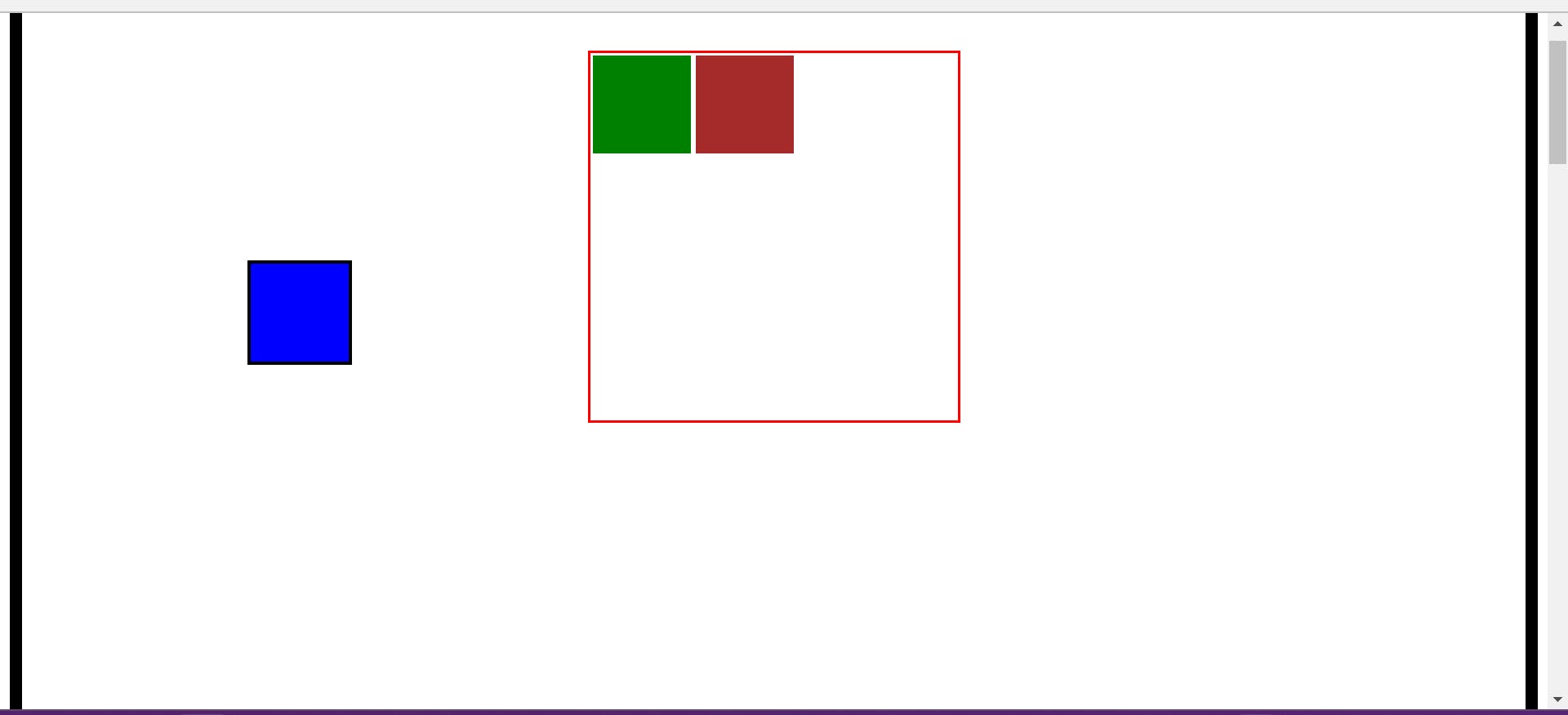
Absolute Positioning:
The element is removed from the normal document flow, and no space is created for the element in the page layout. It is positioned relative to its closest positioned ancestor, if any; otherwise, it is placed relative to the initial containing block. Its final position is determined by the values of top, right, bottom, and left.
So let us apply position: absolute for the blue box:
.box2{
              position:absolute;
              top:100px;
              left:100px;
        }

From the above illustration, we can see that the blue box moved from the normal flow and is moving relative to the body (i.e, the blue box is 100px from the top and left of the body.)
If we make the container position relative and the blue box position absolute then the box moves 100px from the top and left concerning the container:
.container{
position:relative;
}
.box2{
  position:absolute;
  top:100px;
  left:100px;
}

From the above illustration, we can see that the blue box moved concerning the container.
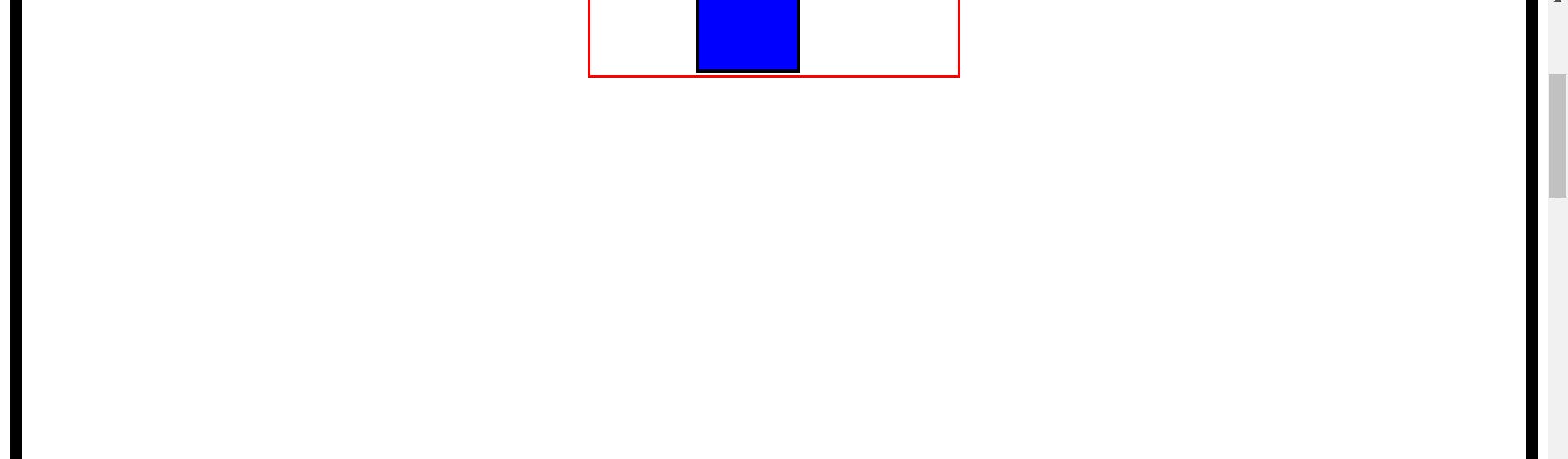
Fixed position:
The element is removed from the normal document flow, and no space is created for the element in the page layout. It is positioned relative to the initial containing block established by the viewport, except when one of its ancestors has a transform, perspective, or filter property set to something other than none, in which case that ancestor behaves as the containing block. Its final position is determined by the values of top, right, bottom, and left.
Let us set the height of the body to 3000px so that we can scroll down and fix the position of the blue box to fixed:
body{
height:3000px;
}
.box2{
  position: fixed;
  left:200px;
  top:200px;
}
The blue box moves out of the normal flow and is 200px from the left and right to the body and stays there relative to the viewport even if we scroll down.
Fixed positioning is useful if you have a navigation bar or sidebar that you want to stay fixed. An element with position fixed is positioned relative to the viewport, which means it always stays in the same place even if the page is scrolled.
Sticky position:
The element is positioned according to the normal flow of the document and then offset relative to its nearest scrolling ancestor and containing block, including table-related elements, based on the values of top, right, bottom, and left. The offset does not affect the position of any other elements.
 .box2{
          background-color: blue;
          border:3px solid black;
           position: sticky;
           left:100px;
           top:100px;
        }

When we scroll the screen the blue box stays there till the bottom of the container (i.e, the blue box sticks at the position that is given). When we scroll further the blue box also moves along with the container.
Visibility:
The visibility property specifies whether or not an element is visible.
The default is
visibility: visible, this doesn't show any effect.visibility: hidden: The element is invisible, but the space that the element occupies remains the same.display: none: The element is invisible and no space is occupied by the element.
Z-index:
The z-index property specifies the stack order of an element.
An element with greater stack order is always in front of an element with a lower stack order. z-index only works on positioned elements (position: absolute, position: relative, position: fixed, or position: sticky) and flex items.
The z-index property is specified as either the keyword auto or an integer.
Note: If two positioned elements overlap without a z-index specified the element positioned last in the HTML code will be shown on top.
In the above same example we will make some changes :
 .box2{
        position: relative;
        left:30px;
        z-index:1;
 }
The blue box moves to the left by 30px and stacks on the top of the brown box.

Now if we make the z-index of the brown box greater than 1 then the brown stacks over the blue.

This is all about the positions, visibility and z-index in CSS.